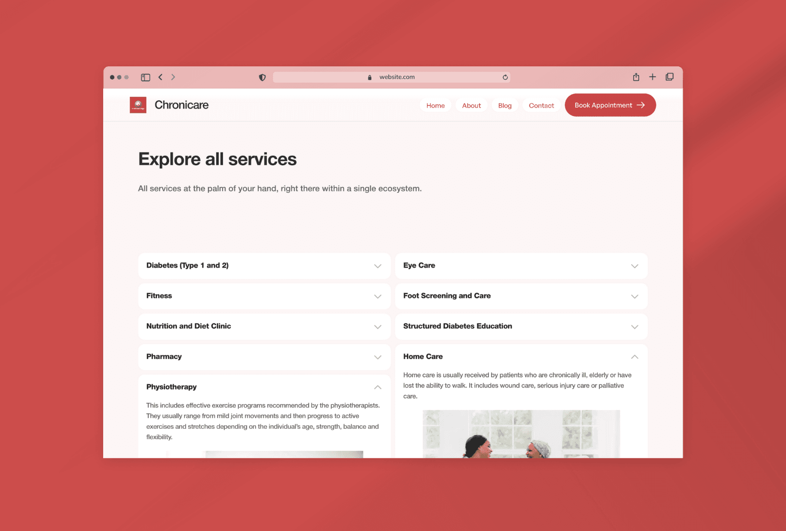
Chronicare Diabetes Clinic - Website design and development
Project Overview
What I did
Website audit
Bespoke UI Design
Search Engine Optimization
Blog Integration
Live Chat Integration
Social Media Integration
Contact Form Integration
Front End Development using Framer
Mobile Responsive Development
Usability testing
The Challenge
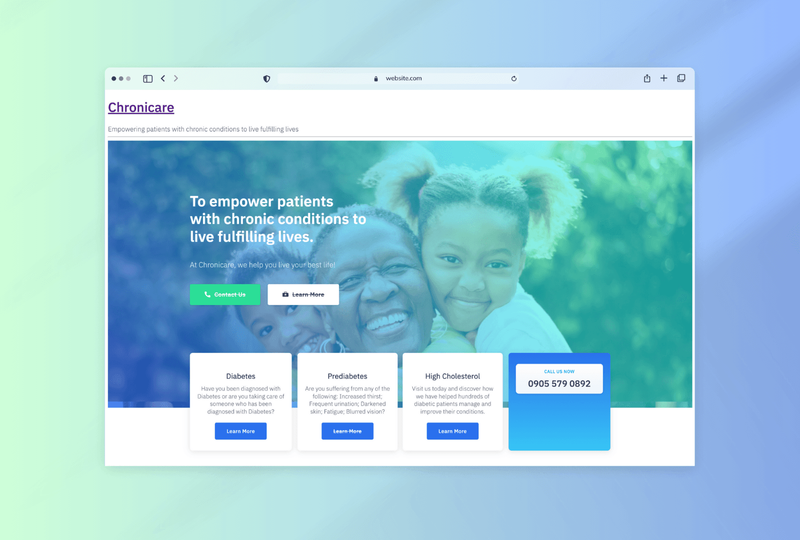
A client approached us with a website that was struggling to deliver a positive user experience. The website was not mobile-responsive, had broken CTAs, and lacked sufficient content. Additionally, the user journey was confusing, with the "Book Appointment" process leading to unexpected redirects.
The previous website looked like this:

The Solution
To address these issues, we implemented a comprehensive redesign strategy:
1. Content Audit and Strategy:
Content Gap Analysis: We identified missing content areas and prioritized the creation of new content to enhance user engagement.
Content Organization: We categorized content into logical sections and pages, ensuring a clear information hierarchy.
Content Optimization: We optimized content for SEO and user readability, using clear headings, concise language, and relevant keywords.
2. Wireframing and Prototyping:
Information Architecture: We mapped out the information architecture to ensure a smooth user flow.
Wireframing: We created low-fidelity wireframes to visualize the layout and structure of each page.
Prototyping: We developed high-fidelity prototypes to test the user interface and user experience.
3. Design and Development:
Responsive Design: We designed the website to be responsive, adapting to different screen sizes and devices.
Visual Design: We created a visually appealing design that aligned with the client's brand identity and target audience.
Front-End Development: We implemented the design using HTML, CSS, and JavaScript to ensure cross-browser compatibility.
Back-End Development: We integrated the website with the client's content management system (CMS) to enable easy content updates.
4. User Testing and Optimization:
Usability Testing: We conducted usability tests to identify any usability issues and areas for improvement.
A/B Testing: We tested different design variations to optimize user engagement and conversion rates.
Performance Optimization: We optimized the website's loading speed and performance to ensure a smooth user experience.
Challenges encountered and how I solved them
Delays - Initially, the clients were very responsive and the project kicked off at a good pace. However, at a point, the website development was stalled because of some internal management decisions. I communicated well with the contact person who updated me when necessary on the next steps. The project took longer than required but it was fun building it.
Choice of low-code tool - So, I started building chronicare.org on Webflow. However, there were some interactions that I needed to implement and Webflow was not making it easy for that to happen. I wanted a fluid experience while navigating the website. I knew immediately that Framer would give that fluid feel. Therefore, I switched and redesigned the entire website. It turned out even more beautiful.
Content - This was my biggest challenge so far, as there was hardly any usable information from the previous website. Since I was the only one working on this project, I worked with the contact person who provided me with some pictures, some of which were blurry. The rest of the images used were from unsplash.
Slow loading - Well, I did not encounter this problem because I already learned from previous experience to use very light-weight images. It was more of a potential problem to look out for. I avoided this situation by converting the images into WEBP before uploading them.
Image not sizing well: Sometimes, the images would appear stretched or shrunk. Sometimes they were too zoomed in for the frame I wanted. what I did was to ensure the images were set to "Fit Content" instead of "Fill". The equivalent of this on Webflow is "Contain" instead of "Cover".
Results
By implementing these strategies, we were able to transform the website into a user-friendly and effective online presence. The redesigned website:
Improved User Experience: The new design was more intuitive and easier to navigate.
Increased Conversions: The fixed CTAs and improved user experience led to higher conversion rates.
Enhanced Brand Image: The visually appealing design and clear messaging helped to strengthen the brand's image.
Boosted SEO: Optimized content and improved website structure resulted in better search engine rankings.
Next Steps & Takeaways
This case study demonstrates the importance of a well-designed website in achieving business goals. The client loved it and they want me to add extra pages such as blog, health screening tool, etc. In addition to these, I would be assessing the performance of the website. I noted the data from the time the website was launched, and then a week after. Periodically, I will ensure that the website is up an running, and that it is easily accessible to many devices. Generally, I enjoyed building this project.


